There is never a worse feeling than when someone promises you the world, but ends up giving you a nickel and a shrug. It is even worse when a game that has been hyped for months as the future of the first person shooter turns out to be an unfinished heap of unexplored ideas. It is like the awful relationship that starts with such high hopes. You think that this will change my whole life! And it does… for the worse. Brink… why did you have to go and break my heart like this?
Platforms: PC, PS3 (Version Played), Xbox 360
Publisher: Bethesda Softworks
Developer: Splash Damage
Genre: First-Person Objective-Based Shooter
Release Date: May 10, 2011
ESRB Rating: Teen
I was looking forward to Brink. From all the production videos posted on the developer’s website, it looked as if I would be released from the grip of the brown, cover-based first person shooter. But all the hype and anticipation just made Brink even more of a disappointment. Brink brought me up to the top of a beautiful seaside cliff to admire the view before pushing me off into the abyss of a hackneyed story and broken game design.
Let’s get the first impressions out of the way. Brink was terrible right out of the gate. If it was a first date, I might have gone to the bathroom and never come back. The introduction video quickly set up your standard cliched bit of story into which to insert levels and players. I was told about the Ark, a floating city that was mankind’s last haven after some sort of global catastrophe. It looked and sounded suspiciously like global warming melted the ice caps. As usual, humans can’t be expected to play nice together and the Ark became divided into two groups: the Security, charged with protecting the Ark and the resources, and the Resistance that plans to use those resources to cobble together a plane in order to escape. To where? They haven’t quite figured that out yet.
Next up came the character design phase. Now, any decent game with customizable characters will give you hundreds of options right in the beginning. Not Brink. You have to earn your right to accessorize. All you get to choose from are generic body types, different voices, and a paltry selection of clothing. Granted, the customization options did open up a bit by the end of the main campaign, but who would want to bother with character design at that point? Often after each level a player is searching online for Brink’s trade-in value.

Brink was lauded as being able to seamlessly combine online and offline play through a unique and engaging story campaign. This more or less translates to: this is a multiplayer game where you can play with AI bots with maple syrup for brains when your broadband connection is down.
Each level is introduced with unbearably terrible, but thankfully short, cutscenes that try to set the scene. They try and fail. The characters looked like something out of last generation’s consoles. The animation itself was very buggy. I usually found myself staring in horror one time while a character’s teeth started moving independently from his jaw like some sort of digital shark. The audio mixing is patchy at best and I frequently found myself listening to only background music while two characters mumbled inaudible things. Most of the time I was thankful that I couldn’t hear the dialogue. I couldn’t shake off how terribly the lines were written and how they were made even worse by some really bottom notch voice acting. Choruses of “Let’s get ‘em!” and “For the Ark!” still ring in my ears. One more question concerning the voice acting: Why is it always that the man with a thick Eastern European accent is at the head of any Resistance? I kept expecting my next objective to be “capture Moose and Squirrel.”
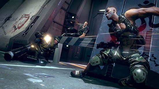
Once inside the game and moving around, you will discover that the screen is overflowing with flashing things vying for your attention. There are icons for your class, objective, and weapons too. There are icons for your flim flam and chim chim cheroo. It seems as though the designers couldn’t decide what information was important for the player, so they just threw it all up there. What really got confusing was trying to change objectives from the stubbornly complicated menu wheel while in a firefight. As soon as you select a goal, you are automatically spun towards its location and it is highlighted even if it is behind a dozen walls. Everything in Brink glows like it was doused with fluorescent paint and stuck under a black light. I frequently found myself simply aiming at anything that came up as red on my screen. That was my plan for clearing a room of enemies so I could run up and mash the action button against some console in order for the level to mercifully end.

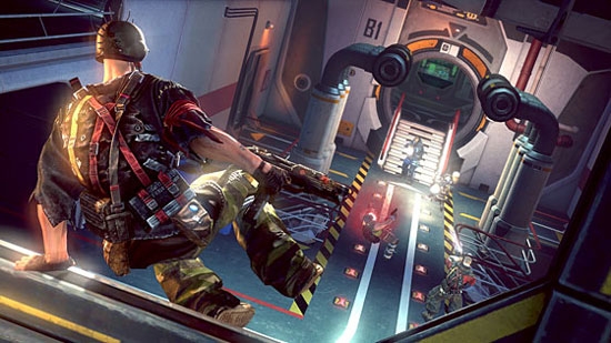
The levels were laid out in sometimes awkward ways. I found myself always having to climb through ductwork in order to progress through the level. The flotsam and jetsam scattered about in each room to allow you to make full use of the SMART button. SMART stands for Smooth Movement Around Random Terrain. The SMART button is the one piece of innovation worth keeping around from Brink. The SMART button allows you to vault up to balconies or slide under piping. It is a simple way of integrating parkour into a game that is very reminiscent of Mirror’s Edge. Surprisingly, it works pretty well. It assimilated itself into my collection of twitch reactions and in no time I was running up walls and sliding through doorways. It dissolved itself into gameplay like all good mechanics should. As with the rest of Brink, it too has its bugs. Sometimes it doesn’t work and you find yourself face-first in a wall trying desperately to clamber up and out of a firefight. All in all, I wouldn’t mind seeing a refined version of this mechanic in another first person shooter.
The biggest problem with Brink is that it feels unfinished. After being thoroughly confused by the way the story was presented in the game, I delved into the instructional booklet. There is always a quick snippet expounding on the story. Brink was no exception, and the story they laid out was unbelievable. After all the hours spent doggedly slugging my way through the actual game, I found myself captivated by the ideas set down in the booklet synopsis. I wanted to explore more of the Ark, but I didn’t want to explore any more of Brink. God knows I’d had enough of that. It was then that all of the pieces clicked together: Brink is the multiplayer afterthought to a really fantastic single player game. If you have played BioShock 2, you know what I mean.
Brink promised a lot. It promised to pick up its socks and take out the trash. It promised to always be fun and fresh. It promised to water the plants. Now all my plants are dead and Brink and I are no longer talking. Brink, I think it is time you moved out of the house. I don’t want to bring you home to my mom. You just aren’t polished enough. You are all hype and no substance. Brink, I’m breaking up with you. Now pack yourself in that bubble wrap and get in the box, you are going to Amazon’s trade-in division where you belong.

Review Disclosure: A retail copy of Brink was purchased by Warp Zoned for the purposes of this review.


