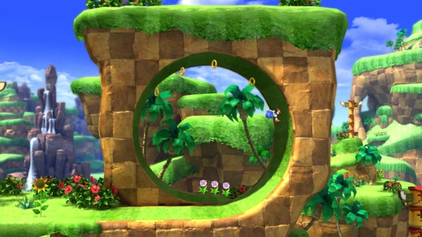
Sega has officially decided that Sonic’s 20th anniversary needs a little commemoration, and what better way to celebrate than introduce Sonic Generations, a 2D/3D variable game honoring the hedgehog’s past and recent achievements? That was the intention, anyway. The initial trailer for this game has once again involved many gamers in “The Sonic Cycle,” the ailment that falls over classic fans of the Genesis series, causing initial excitement followed by disappointing suicide threats. It seems that 2011 is no different from any other year with a Sonic release, because The Sonic Cycle is at an all-time high if the finished product is anything like the demo (though a disclaimer states that it may not be).
Platforms: PS3 (Version Played), Xbox 360
Also On: 3DS
Publisher: Sega
Developer: Sonic Team
Genre: Dual-Dimensioned Platformer
Release Date: November 22, 2011
ESRB Rating: Rating Pending
The Sonic Generations demo opens with a polished intro screen with a modern variant of the classic Sonic 2 title screen music. The Sonic Cycle takes effect. I press Start, hit a loading screen, and finally lace up the hedgehog’s famous red running shoes. The level opens, and I begi– wait, what? THAT’S the character model they decided to use for this game? Uh oh. This model bears almost no similarity to those shown in the Generations trailers, and could’ve easily been lifted from a Flash-based Google-ad Sonic knockoff game. “Okay,” I sigh to myself, “maybe this will change later in development.”
The side-scrolling gameplay found in the “Classic” or 2D mode of Sonic Generations isn’t all it’s cracked up to be. The physics have received a welcome change from Sonic 4: Episode 1, but there are still problems with the visuals. I understand that this version is “unfinished,” but it’s very difficult to see anything going on while running at full speed. Trees and objects are incomprehensible, and it seems like the rendering speed is to blame. A returning complaint is another camera problem – the last couple of side-scrolling Sonic games (Sonic Colors, Sonic 4) seemed to be zoomed in too closely, preventing the player from seeing their destination. With Sonic Generations, it may be that the model of Classic Sonic is so small that zooming in is the only way to make him visible. Seriously, Classic Sonic looks to be about half the height of Modern Sonic. What, did he get two feet taller before Sonic Adventure?

The first stage of Green Hill Zone starts with a pretty hum-drum attitude. It’s the same level design from the other Sonic games, but it seems even more watered down, as if done intentionally to show off their new design approach. I don’t see the logic in intentionally dumbing down the first half of a stage in order to make the second half shine more, but it’s fine, I guess. At one point in the level, it does take a literal twist (yes, Sonic goes around and around) into the newer-styled, updated section of Green Hill Zone, where Generations starts to feel a bit more like Sonic Colors. The new section offers more gaps, wall-to-wall jumping, and actual platform-jumping skills. Less enemies appear, and visual finesse is more frequent. It’s tough to say that the new platforming style is better, but it is certainly different. The level closes with the standard spinning signpost as expected, and Sonic is led off-screen, possibly retiring to have a cigarette before the next act.
…And I am left with an unenthused expression on my face. While it looks as though the creative team strove to stick to the level design of Sonic 2, it’s my personal opinion that more innovative level design existed in Sonic 3 and Sonic and Knuckles. I know everyone regards Sonic 2 as the best Genesis game in the series, but that doesn’t necessarily mean that the developers shouldn’t continue to make a push in the same direction that the original series was headed. Had they made a Sonic and Knuckles 2, or even Sonic 4, back when the games were still in their prime in the early 90’s, then incorporating level design from Colors may have potentially worked. It seems like Sonic Team is creating stages in the style of Sonic Adventure, and turning them sideways in order to make a side-scrolling game. It just won’t work that way.
I’m a picky Sonic fan, I know I am. The initial premise of the game seemed exciting; it looked like something that I really, genuinely wanted to sit down and bust through a couple hours with. If the game ends up being released similar to the state it’s in now, then that premise will be off by a longshot. In fact, it may end up in the bargain bin faster than Sonic Colors did. Or maybe, just MAYBE, Generations still has the potential to break out of The Sonic Cycle.


